 In 1932, Curtis Publishing released a marketing study based on what we would now call a “mashup” of circulation data for the popular Ladies’ Home Journal and Saturday Evening Post magazines, assorted items of market research, and 1930 census data. This early depression era exercise in what Mark Twain had dubbed “lies, damned lies, and statistics” represented a thin veneer of science over a marketing message for Curtis advertising department, but it paints a fascinating and stark picture of the demographics of Walnut Hills.
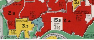
The publisher used circulation information to calculate a “Curtis Index” for each census tract: the ratio of the number of families to the number of news stand purchases and subscriptions to the Saturday Evening Post and Ladies Home Journal in that region. (In those days, store-bought copies vastly outstripped subscriptions.) The lower the Curtis Index, the more likely the families in the district consumed the magazines.
The marketing managers for each city then conducted research to establish the advertising value for various sorts of businesses. Examples include a correlation between the number of Cadillac or LaSalle automobile owners in a Curtis Index region, or the number of brand name grocery items in a subscriber’s pantry, or (in Cincinnati) the number of households in the district with accounts at leading men’s furnishings stores.
The Curtis city maps showed areas with the highest rates of subscription in red – “hot” areas for advertisers – those with high rates in yellow, those with low rates in green, and “cold” districts with extremely low subscription rates in blue. (This convention led a Detroit researcher to coin the term “Blue-Lining”; see https://detroitography.com/2017/01/18/map-detroit-neighborhood-markets-blue-lining-1932/ for the post.) Curtis Publishing developed its own system of outlining Curtis Regions, ignoring traditional neighborhood names or political boundaries. If we take readership of the magazines as a proxy for white middle class households, we see a very sharply defined part of Walnut Hills painted out of the picture, as well as the West End downtown. The much smaller population of the Blue Region in Walnut Hills was three-fourths “Colored” – the West End was just a little over half – though the population in the Walnut Hills region was not so dense. (I have moved some of the labels on this copy of the map for readability.)
It is notable that the eastern boundary of African American Walnut Hills ran along Victory Parkway, completed in 1928. Whatever the intent of the routing of the new street, it created a formidable barrier between the white middle class East Walnut Hills and Blue-lined neighborhood. (The road was so new that the map misspelled the name as “Victoria.”) McMillan was the Southern blue line; on the west, Gilbert bounded the community south of Lincoln Avenue; north of Lincoln, it widened toward Reading Road. The north line followed Ridgeway Avenue, now a few blocks northwest of the current Interstate 71.
The Curtis map was partly a description of Cincinnati as it was, and partly a self-fulfilling prophesy. The distribution department placed the magazines in the red and yellow regions, but ignored the green and blue. It advised the marketing and advertising agencies to whom the book was ostensibly targeted to do the same. The market research explicitly sought native-born white families as consumers of name-brand groceries, exclusive men’s furnishings, and prestigious automobiles. Segregation and the exclusion of even the substantial middle-class African American community in Walnut Hills spread even to the distribution of magazines.